A landing page’s primary purpose is to drive visitors to take action—whether it’s signing up, buying a product, booking a call, or downloading something. But the reality is, most landing pages fall short because they confuse users, overload them with options, or fail to communicate the value clearly.
Let’s explore the most common design mistakes that kill conversions and what you can do to fix them.
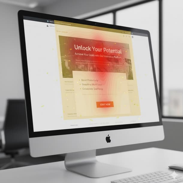
1. Unclear Value Proposition Above the Fold
Your headline is the first impression you make on a visitor. If they don’t immediately understand what you’re offering, they’ll leave. Most visitors only spend a few seconds deciding whether to stay, so it’s crucial that your value proposition is crystal clear from the start.
Mistake: Headlines that are vague or overused, like “Innovative Solutions for Modern Businesses,” don’t tell visitors exactly what you’re offering.
Solution: Your headline should answer three key questions: What is this? Who is it for? Why should I care?
For example, instead of “Smarter Growth Starts Here,” use something like “All-in-One Project Management for Remote Teams.” This immediately tells users what the product is, who it’s for, and why it matters.
2. Too Many Calls to Action
When visitors are presented with too many options, they freeze. A landing page with several calls to action (CTAs)—such as “Sign Up,” “Learn More,” and “Contact Us”—creates confusion and diffuses the page’s main goal.
Mistake: Trying to cover every possible action dilutes focus and prevents visitors from committing to any one thing.
Solution: Your landing page should guide users toward one clear goal. If your objective is to get demo requests, focus entirely on that action. Other secondary CTAs should be visually de-emphasized or removed completely.
A focused landing page, with one clear CTA, will always outperform one that tries to cater to every possible user action.
3. Weak Visual Hierarchy
People don’t read— they scan. This means if your design doesn’t guide their eyes toward the most important information, they might miss it. A lack of visual hierarchy can cause confusion, leading users to overlook key details and ultimately leave without taking action.
Mistake: Using headings that don’t stand out from body text, cluttered layouts, or information that isn’t arranged logically can make your page hard to navigate.
Solution: Organize your page so that users naturally follow a clear flow. Start with a strong headline, followed by a subheadline, key benefits, proof (such as testimonials or case studies), and finally, the CTA. Break up text into short paragraphs and use bullet points or icons to make key information easier to digest. This layout not only keeps the page clean but ensures that important information is always front and center.
4. Ignoring Mobile Experience
With mobile traffic dominating, your landing page needs to be mobile-friendly. Yet many landing pages still prioritize desktop design and ignore how users will interact with the page on smaller screens.
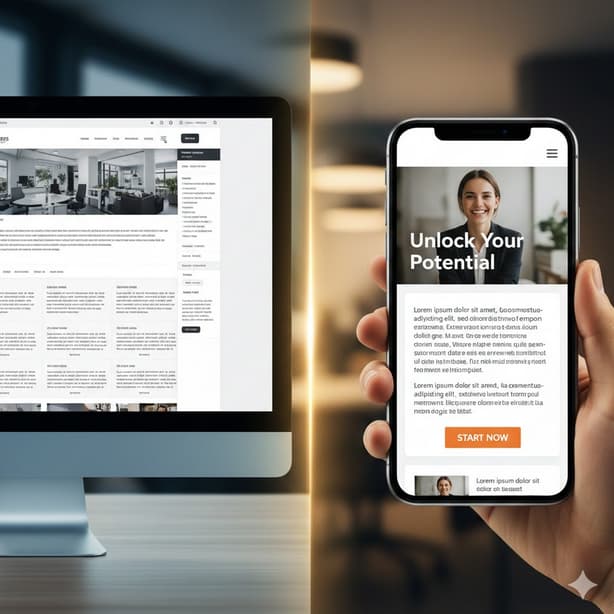
Mistake: Tiny buttons, text blocks that are overwhelming on mobile, or popups that take over the screen all contribute to a bad mobile experience.
Solution: Prioritize mobile-first design, ensuring that buttons are large enough to tap, text is easy to read, and the page loads quickly. Regularly test the mobile version of your landing page, not just using tools but also manually on various devices. Mobile optimization should be just as important as desktop design.
5. Lack of Social Proof
Trust is a major factor in conversions. Visitors are more likely to take action if they can see that others have had a positive experience with your product or service.
Mistake: Skipping social proof or using generic testimonials without any real substance.
Solution: Include testimonials from real customers with specific outcomes. If possible, show names, job titles, and companies alongside the testimonials to add credibility. You can also use case studies, client logos, or reviews to reinforce trust. Place social proof strategically, especially near the decision-making points on the page, such as before the CTA.
6. Asking for Too Much Information
When it comes to forms, less is often more. The more fields you add to a form, the less likely users are to complete it. Long, complicated forms are a major barrier to conversion.
Mistake: Asking for unnecessary details too early in the process can overwhelm users and lead to form abandonment.
Solution: Only ask for the information you absolutely need. If you can get away with asking for just a name and email, do it. Move any additional questions to later stages of the process. Also, provide clear explanations of what happens after the user submits their information. For example, tell them they’ll receive a follow-up within 24 hours or offer a free resource after submission.
7. Distracting Visuals and Animations
Animations can enhance the user experience if done right, but when they’re overused or distracting, they can take attention away from the CTA and confuse the visitor.
Mistake: Adding unnecessary animations, stock photos that don’t add value, or flashy background videos that slow down the page.
Solution: Use visuals that are meaningful and support your message. For example, product images, before-and-after comparisons, or illustrations that help explain the offer. Animations should only be used sparingly and should guide the user’s focus, not pull it away. Avoid background videos that slow down load times, as page speed is critical to conversions.
8. Slow Load Times
The faster your landing page loads, the better the user experience. Slow loading times can frustrate visitors and cause them to abandon the page before they even see your offer.
Mistake: Large image files, unnecessary scripts, and an overload of third-party widgets can dramatically slow down page speed.
Solution: Optimize images, reduce the number of scripts and fonts, and streamline your design to minimize load times. Speed is essential, and a faster page leads to a better user experience and, ultimately, more conversions.
9. Not Handling Objections
Every visitor has concerns—whether it’s about price, commitment, or the risk of taking action. Failing to address these objections can lead to abandonment.
Mistake: Leaving users with doubts about the product, service, or next steps without addressing potential objections.
Solution: Proactively answer common questions or concerns. Use a short FAQ section to address issues like pricing, refunds, or trial periods. You can also reduce perceived risk by offering guarantees, like a money-back promise or no-credit-card-needed free trials.
10. Designing for Stakeholders, Not Users
It’s easy to fall into the trap of designing a page to please internal stakeholders or follow trends instead of focusing on the actual needs of the users.
Mistake: Designing a landing page based on personal preferences, internal feedback, or outdated ideas of what “looks good” rather than what drives conversions.
Solution: Keep the focus on what works for your target audience. Test ideas based on real user behavior, not subjective opinions. Your design decisions should always be guided by the goal of improving user experience and making decisions easier for visitors.
Final Thoughts
Building a high-converting landing page doesn’t require complex design techniques or flashy elements. It’s about understanding your visitors and creating a seamless experience that guides them toward taking action.
By eliminating confusion, offering clear direction, and focusing on user needs, you can turn your landing page into a conversion powerhouse.